I love the combination of yellow and gray. Do you? When I paint, I love to use all kinds of bright colors - aquas, pinks, oranges. But, I also really like to pair a bright (or even in the pastel version of the color) with a more muted color like gray. I think the contrast is really pretty.
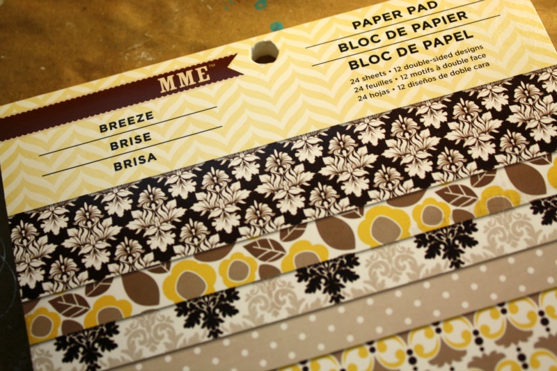
While I was wondering the aisles of Michaels (I know, I know, I have a problem. Ha!) I found some fabulous scrapbook paper by My Mind's Eye. It was in a little 6x6 paper pad which I love. That size works really well for background paper. The patterns are shrunk down compared to a 12x12 sheet, so the small size looks great on the canvases or journal pages I work on. The colors in this pad were a perfect jumping off point. Sometimes paper is all you need for a little inspiration. LOVE. L.O.V.E.
So with this My Mind's Eye paper as my inspiration, I used an old wood block that I had laying around and started to cover it up with the pretty paper. I have quite a few of these blocks laying around. I did stock up around the holidays (sales + gift cards = happy camper) with canvases, but wood is my favorite. It is super cost effective to go to a home improvement store and have some wood cut down to the size you prefer. Well, or have a very handy hubby cut the wood for you. :)
After attaching my papers with Mod Podge, I threw on a layer of gesso. Then hunted through my stash of paint to find my pretty yellows and grays (pictured above - so yummy! Right?). Besides the color choices, I planned on just letting the piece come to me. No real thought as to what I wanted to paint - just the colors.
From the background I began to see a face emerge, then a headband with a feather (I have seen a lot of feathers lately) and then the words...be brave in truth. Right? I love that saying. I love the word brave. There are so many degrees of bravery aren't there? But, I know for me...speaking truth and trying to be true to who I am & my tender, sensitive heart takes a bit of courage.
Here she is all finished and just waiting for a varnish bath. After that she will be on her way into my shop. :)
What color combinations are inspiring you lately?


You just inspired me with the the gray and yellow!! I have been using magenta, aqua, blue, together they can make different shades of purple.
ReplyDeleteLove your canvas...very nice job...so pretty. I have been wanting to do a yellow and purple...but this idea is better!
Hugs Giggles
Brave! Such a literally and figuratively powerful word :) One thing I always appreciate about your art works is the incoporation of a positive and encouraging theme. You see, more than a beautiful piece of art work, a little encouragement from every piece of priceless beauty goes a long way.
ReplyDeleteyou have honored yellow and gray beautifully
ReplyDeletesuch a lovely piece~
She looks great! I love the color combo.
ReplyDeleteShe is beautiful Jen... I love the color combo you have used... how fabulous they are together... and the papers are gorgeous...
ReplyDeleteJenny ♥